Updating Albertus for the City of London
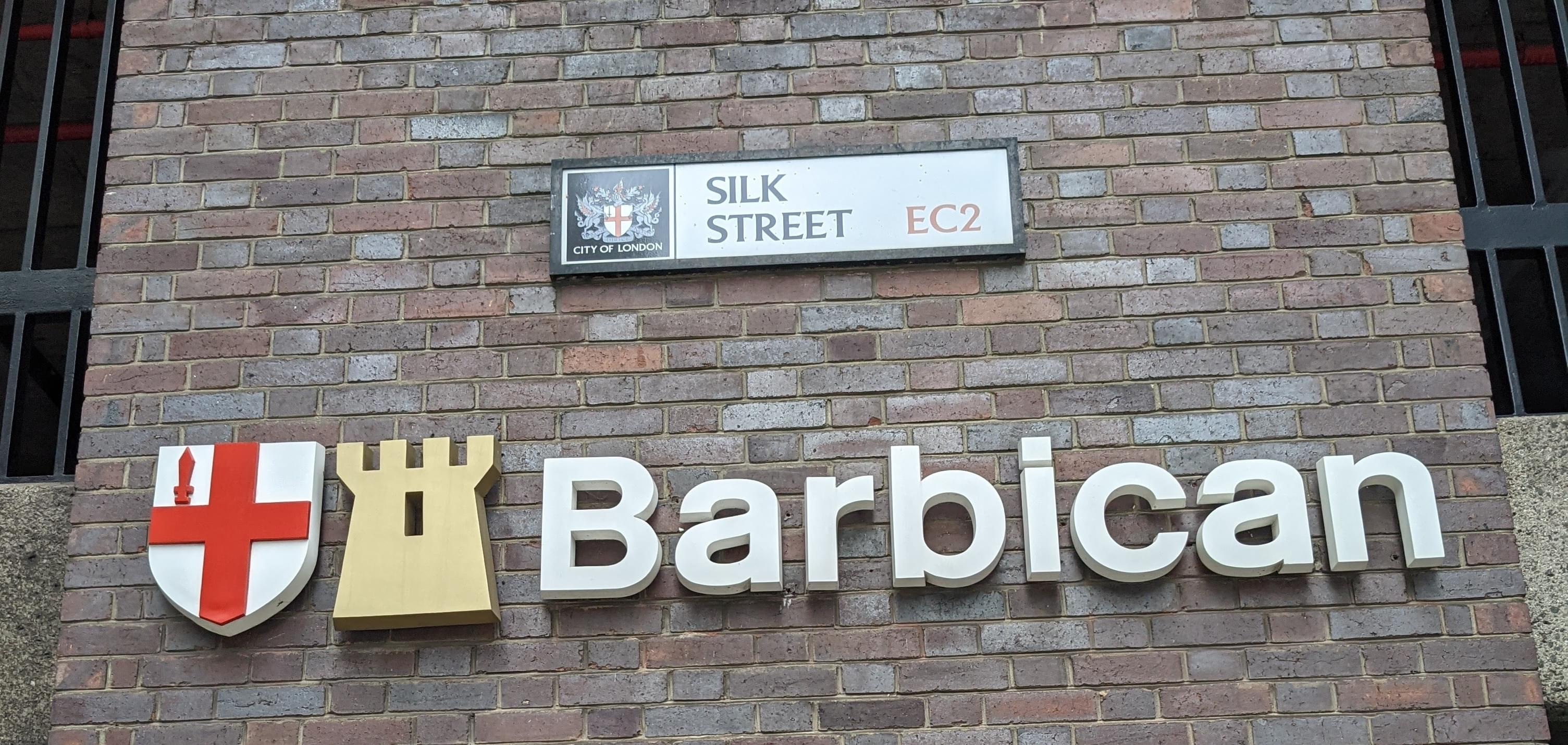
I stayed for a few months in London, helping set up a new SRE team for work there. I was always struck by how uniform the signage and branding within the City of London was (contrasting with the varying styles in the larger, lowercase city).
Today while looking going down a rabbit hole about road signs and typography, I came across this article.
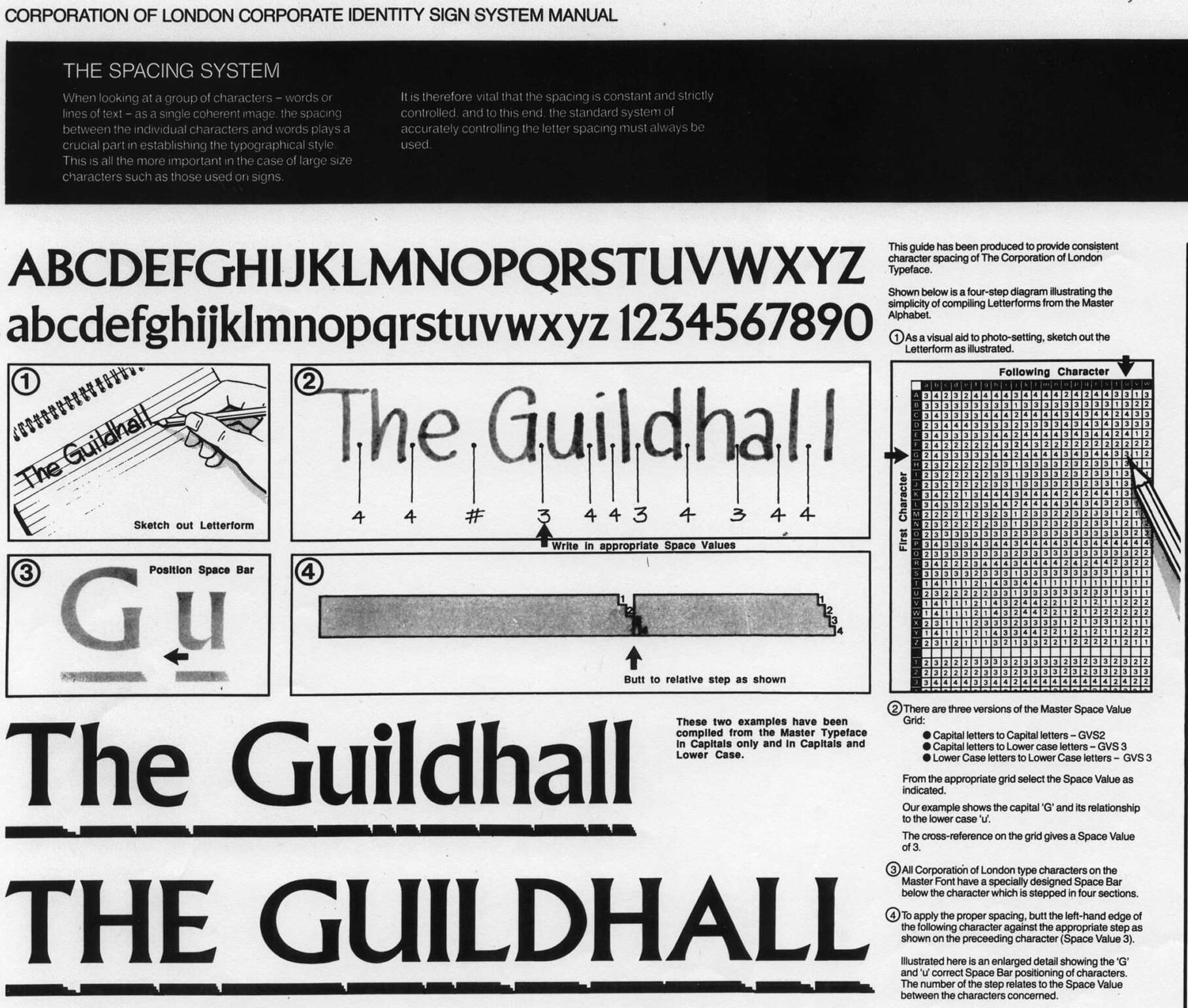
It shows that the City has had a Corporate Identity Sign Manual since the late eighties, with a special version of Albertus to boot!
Somewhat ironically, the article also points out numerous variations in the actual signs at various places, which I definitely didn’t notice the first time around.