Consumption and convenience
Roasted seaweed is a snack that I first ate in the US. I like its umami taste a lot; and apparently it is quite rich in minerals too. Never one to indulge in moderation, I picked up a 10-pack at Costco recently.
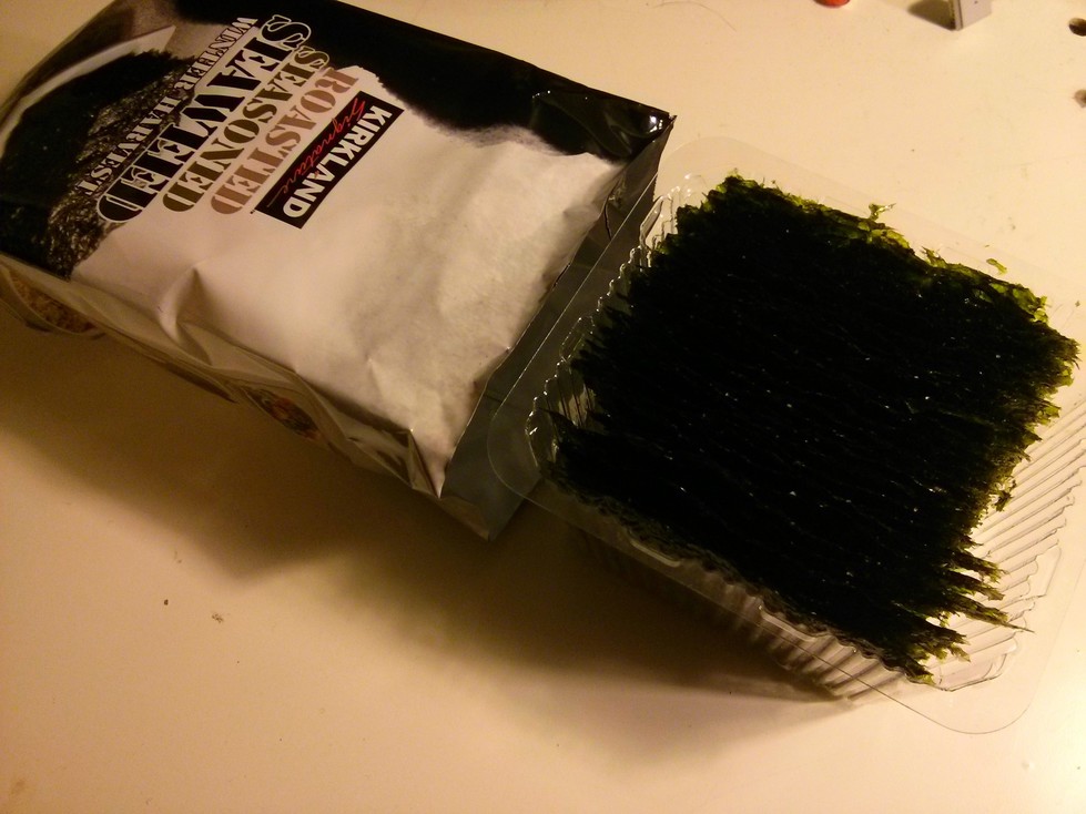
When opening one of the small packs, I noticed that if cut the “normal” way (i.e., parallel to the crimp with the serrations) the plastic tray that slides out has the sheets oriented in such a way that you have to pull the whole tray out to eat a single sheet.

Plastic tray perpendicular to package opening
At first I though this was a simple design flaw. But thinking about it further, it probably makes sense from the point of view of the company. Seaweed being a highly addictive snack, if I pull the entire tray out, I have a higher probability of finishing the whole thing. If I could pull only a third of it out, and eat only that, saving the rest for later – Kirkland would probably sell me fewer packs. I tried to get around this by turning it sideways and pushing it back in, but the dimensions don’t make this feasible. I could always cut the packaging from the side, but that would just be wrong, and probably messier.
Anyway, this goes to show that user convenience and the seller’s incentive to get you to consume more can be completely at odds with each other. I guess this is something to keep in mind while analysing user interfaces, specially those that include things such as in-app purchases.
❧ Please send me your suggestions, comments, etc. at comments@mandarg.com